This article originally appeared on architectureau.com.au.
This home demonstrates fresh approaches to working with a heritage site, the clever design a testament to both the skill of the architects and the courage of the owners.
The tension between historically protected streetscapes and workable contemporary architecture creates a common enough design dilemma in our cities. In Brisbane’s West End, there’s another part of the equation at work – the almost tribal allegiance to the place and the community held dear by so many of its residents. It seems that once you’ve lived there, you don’t want to leave, and while a new gentrification is fast changing the texture of the suburb in certain pockets from humble and multicultural to grand and bland, there is still a treasuring of the area’s authentic roots and a strong allegiance to the concept of community. Translated (or mistranslated) into building codes, the result is sometimes a misplaced nostalgia for less amenable living patterns.
When architect Richard Kirk was commissioned to design a new home in the original West End estate dating to the 1860s, local council regulations promoted a homogeneity that he found unrealistic.
“Council had an abstract notion of the uniformity of the housing styles here. We took photos of every house in the street and recorded how much they differ,” says Richard. “The way they are inhabited often doesn’t take advantage of climate or aspect.”
The site is wedged between two existing houses and served as an easement for both. Its steep plunge from street level to a backyard gully overhung with rampant fruit trees meant the useable spaces were at the front edge, lining up with the original homes that sit behind a narrow strip of land by the street.
Living spaces in the neighbouring homes are generally delegated to the rear of the houses, with bedrooms on the street side, where they are barricaded behind privacy screens or high fences.
Conforming to local council requirements while using the north-facing site to advantage resulted in a new house that has similar proportions to its neighbouring cottages but is better organized for climate and family living.
“We brought light, ventilation and views into the house, rather than gaining these by overlooking other houses,” says Richard. “It’s a good model for the area.”
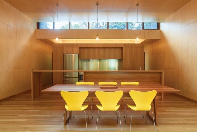
The owner-builder clients, a young family of three, wanted engagement with the street rather than a barrier against it. Living areas and a miniature garden entry court are placed at the front on the north, with two bedrooms at the back overlooking the southern gully garden through broad picture windows. The central core of kitchen, bathroom and laundry divides public from private zones via a large timber container that neatly conceals and confines the services. In a gorgeous exercise in joinery, drawers, cupboards, flaps and doors slide, pull, pivot and fold as various sections of the giant container reveal themselves for everyday use before being discreetly rehoused inside the elegant box. Shafts of light penetrate from above – a skylight serves the bathing zone and southern light bounces into other spaces from a south-facing clerestory strip of acrylic panels.
“It’s all about the section,” says Richard, who describes the house as two tubes with solid sides that funnel the air through, while light is brought into the middle. With so little outdoor area on the small 270-square-metre site, the outside is incorporated into the interior, which acts as a courtyard of sorts, walled along its sides and open at both ends. Privacy (both visual and acoustic) is established by the strategy of the solid sides, where the property is so close to neighbours. The side elevation is a massive cantilever of blackened ply cladding that hovers over the gully at the rear and allows for car accommodation underneath.
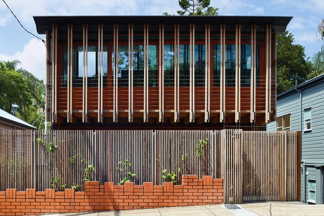
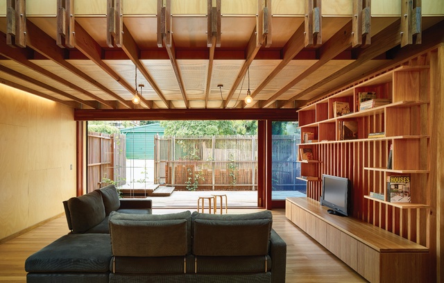
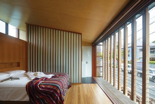
The living room sits beneath a compressed 2.7-metre ceiling lined with acoustic panels. Stacked above it is the airy loft of the main bedroom suite, enjoying full surveillance of its surrounds. An inner skin of glazing peels away to promote optimal ventilation and receive northern light. An outer skin of striated timber encages a narrow strip of balcony and extends existing datum lines in the street. A timber privacy grille also wraps around the garden court below, marching in time with the street’s fence lines.
Materials are economical, with flourishes of more lavish elements introduced at key moments, or “in places that count.” Interiors are clear-finished blonde plywood, which adds warmth and richness. Plasterboard is eschewed, and joinery and floors are all in blackbutt timber. Doorhandles are cut-out negatives of the home in plan, a respectful and fun piece of play executed by joiner Steve Lucas of Anglewood. Recycled hardwood joists each bear their own slight differences and glass panels were painstakingly inserted between them. The expressed joists give insight into the building’s tectonics, not unlike the expression in some of the Colonial cottages nearby, but any direct replication is avoided. Likewise, the mild steel fascias bordering an invisible flat roof buck the trend of tin pyramids in the precinct.
“The house offers a significant demonstration of how to use sites in heritage zones more sensibly,” says Richard. “It’s a new set of ideas, and much credit is due to the owners for their courage in going through a relatively uncertain process.”
Key Information
Architect: Richard Kirk Architecture
Cabinetmaker: Steve Lucas – Anglewood Bespoke
Completed: 2016
Photography: Scott Burrows
Words: Margie Fraser


